


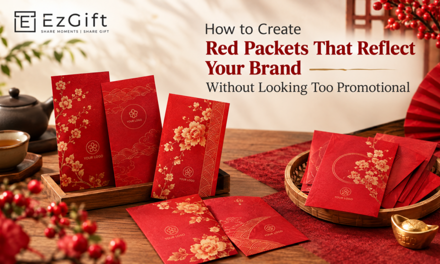
Creating red packets that represent your brand while honoring Chinese New Year tradition requires a careful balance of visual restraint and cultural sensitivity. Keep branding elements subtle logo placement, brand colors used sparingly, and meaningful design motifs so the packet feels like a genuine festive gift, not a marketing insert. The goal is cultural alignment, not advertisement.
Red packets are one of the most meaningful corporate gifting formats during Chinese New Year in Singapore. When done right, they build brand warmth, strengthen relationships, and leave a lasting impression. When done wrong, they feel transactional and hollow. This guide is for brand managers and marketing teams who want to get that balance exactly right.
Why Brand Tone Matters More Than Logo Size
Most companies make the same mistake: they treat a red packet like a business card. The logo goes front and center, the corporate tagline fills the back, and the result looks like a branded envelope rather than a festive gift.
The cultural weight of a red packet comes from what it represents luck, prosperity, and goodwill. Interrupting that with heavy-handed branding breaks the emotional connection you’re trying to create.
A better approach is to let your brand identity inform the design rather than dominate it. Think of it this way: your brand has a personality. Let that personality show through visual language, not corporate signage.
Step 1: Define What Your Brand Wants to Communicate
Before you open any design software, answer these three questions:
- What emotion do we want recipients to associate with our brand this festive season?
- Who is receiving these clients, employees, partners, or all three?
- What design language already exists in our brand guidelines that could translate into festive aesthetics?
A financial services brand might lean into gold tones and geometric precision. A tech company might go for clean lines and minimal iconography. A lifestyle brand could work with warm textures and illustrated motifs. The answer to each question shapes your design direction before a single element is placed.
Step 2: Work Within Chinese New Year Aesthetics, Not Against Them
Traditional red packet design has visual rules and they exist for good reason. Red symbolizes good fortune. Gold represents wealth and abundance. Auspicious motifs like the zodiac animal, peonies, clouds, and lanterns carry cultural meaning that resonates with recipients on a deeper level.
Your brand should enter this space as a guest, not a host. That means:
- Using red as the dominant color even if it sits outside your brand palette
- Incorporating the year’s zodiac motif as a design anchor
- Choosing gold or warm tones for secondary elements rather than forcing your brand’s primary colors
- Keeping typography elegant and legible avoid cluttering with slogans
If your brand color is blue or green, don’t fight the palette. Instead, introduce your brand color as a subtle accent a thin border, a secondary illustration layer, or an interior lining color. That restraint reads as sophisticated, not compromised.
Step 3: Place Your Branding with Intention
Where to Put Your Logo
The back of the packet is the conventional space for branding. A small, single-color logo in a corner feels natural and unobtrusive. It signals who the gift is from without turning the front face into an advertisement.
Avoid embossing your logo large on the front. Even a tasteful logo can feel aggressive when scaled up on a surface that carries cultural significance.
How to Use Brand Colors Without Overriding Tradition
One practical approach: create a two-layer design. The exterior follows traditional CNY aesthetics with red, gold, and cultural motifs. The interior flap or inside lining carries your brand color or a pattern drawn from your visual identity. Recipients notice the detail. It feels premium. And your brand is present without being pushy.
Typography and Messaging
If you include a greeting, use traditional CNY phrases a happy New Year, and may everything go your way. These carry emotional resonance and show cultural respect. Avoid replacing them with brand taglines or marketing copy. A short, sincere line like “Wishing you prosperity in the year ahead” is far more memorable than a product pitch.
Step 4: Choose the Right Customisation Format
Not all customisation options are equal. The format you choose affects both perception and budget.
| Customisation Level | Best For | Brand Impact
|
|---|---|---|
| Logo print on standard design | High-volume, broad gifting | Moderate |
| Custom color palette + logo | Mid-tier corporate gifting | Good |
| Fully bespoke illustration + design | Key clients, premium gifting | Excellent |
| Special finishing (foil, emboss, die-cut) | Luxury positioning, VIP gifting | Outstanding |
For company red packets intended for key clients or senior stakeholders, investing in bespoke illustration and premium finishing pays dividends. The tactile quality of a well-produced packet communicates the same values as a well-crafted pitch deck attention to detail, quality, and respect for the recipient.
Step 5: Think Beyond the Packet The Full Gifting Experience
In Singapore’s corporate gifting culture, presentation matters significantly. A beautifully designed red packet placed inside a custom sleeve, tied with a ribbon, or presented in a branded gift box elevates the entire experience. It shifts perception from “corporate promotional item” to “thoughtful festive gesture.”
Consider pairing your customised red packets with a handwritten note, a quality gift item, or a seasonal treat. The packet becomes part of a curated moment rather than a standalone branded artifact. This approach works especially well for relationship-intensive industries like banking, real estate, and professional services.
Common Mistakes Brand Teams Make
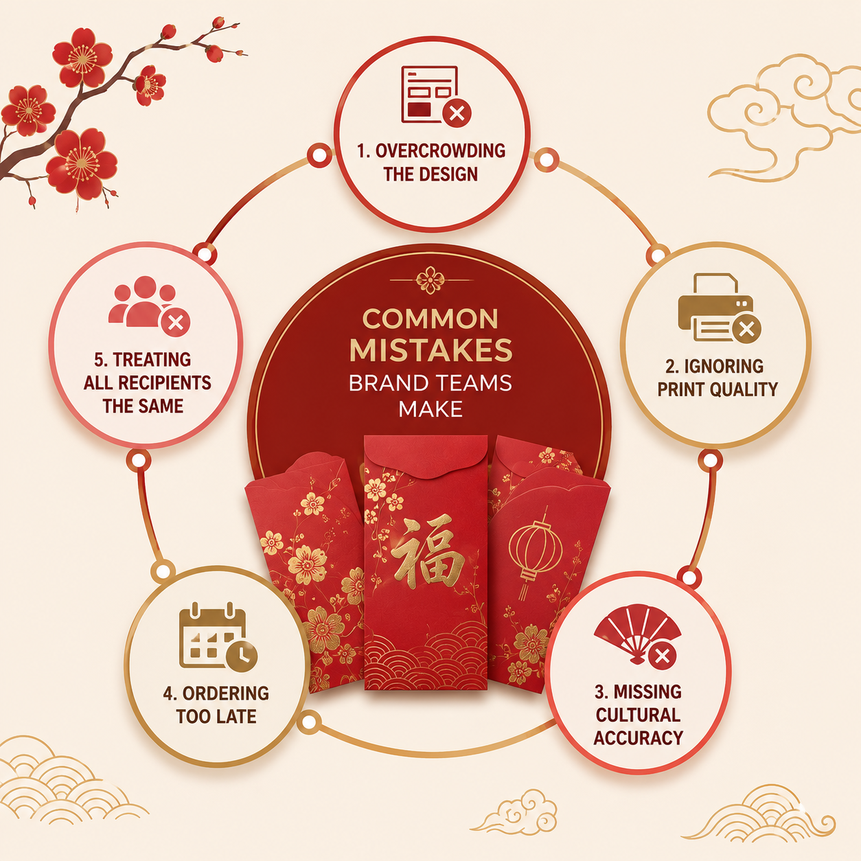
- Overcrowding the design: Multiple logos, website URLs, social handles, and taglines all competing for space destroy the aesthetic and the sentiment.
- Ignoring print quality: A brilliant design printed on thin stock signals cost-cutting, which undermines the brand impression you’re trying to create.
- Missing cultural accuracy: Using incorrect zodiac year motifs, inauspicious colors, or inappropriate imagery creates unintended negative associations.
- Ordering too late: Custom printing in Singapore often requires 2–4 weeks lead time, especially ahead of Chinese New Year when demand peaks.
- Treating all recipients the same: A VIP client deserves a different tier of packet than a mass distribution to foot traffic. Segment your gifting intentionally.
What Makes Red Packets Singapore Corporate Teams Get Right
The most effective red packets Singapore brands produce tend to share a few qualities. They commit to craft premium paper, careful finishing, considered design. They respect the tradition by keeping the visual hierarchy in favor of festive aesthetics. And they use brand presence as a detail, not a declaration.
Brands that get this right often see the packets displayed on desks, photographed for social media, and kept long after the season ends. That kind of organic visibility is worth far more than a logo printed large on a throwaway packet.
Bringing It All Together
The best corporate red packets don’t feel corporate at all. They feel personal, considered, and culturally sincere. Your brand’s role is to be present without being intrusive a quiet signature on something genuinely meaningful.
If you’re planning customised red packets for the coming Chinese New Year season, working with a specialist who understands both print quality and cultural nuance makes a measurable difference. EZGift offers fully bespoke red packet solutions in Singapore, designed to help brands strike exactly this balance from design consultation through to premium production and delivery.
Frequently Asked Questions
How do I add my company logo to a red packet without it looking too commercial?
Position your logo on the back panel in a small, single color version. It’s about keeping it modest in scale and positioning it off the front design so that your branding feels like a signature rather than an advertisement. This keeps the festive integrity of the packet intact.
What is the minimum order quantity for customised red packets in Singapore?
Most Singapore print and gifting suppliers offer customized red packets from 100 to 500 units depending on the level of customization. Fully bespoke designs with special finishes usually have higher minimums. It is best to check with the supplier you choose early in the planning cycle.
How far in advance should I order company red packets for Chinese New Year?
Order 3-4 weeks in advance. In the peak Chinese New Year season, Singapore production slots are quickly filled. For custom designs including illustration, foiling or embossing, please allow 4-6 weeks from design approval to delivery.
Can I use my brand’s non-traditional colors on a red packet?
Yes, but use them as accents, not the main palette. Apply your brand color to interior linings, border details or secondary elements of the design. Using red as the dominant color on the exterior is a nod to the cultural tradition but also allows your visual identity to be expressed in a meaningful way.
What design elements make a corporate red packet feel premium?
Perceived value is enhanced substantially by premium finishes such as gold foil stamping, soft-touch lamination, embossing and die-cut shapes. Thick paper, clean typography and culturally accurate motifs are also helpful. It is the combination of material quality and design restraint that separates a premium packet from a generic one.
Are red packets still relevant as a corporate gifting tool in Singapore?
Yes. Red packets remain a very important gesture during Chinese New Year in the multicultural business scene of Singapore. A successful red packet for client relationship management and employe appreciation is one that shows cultural sensitivity and authentic goodwill traits that resonate well beyond the festive season.